When you add a new form to your page it looks like this:
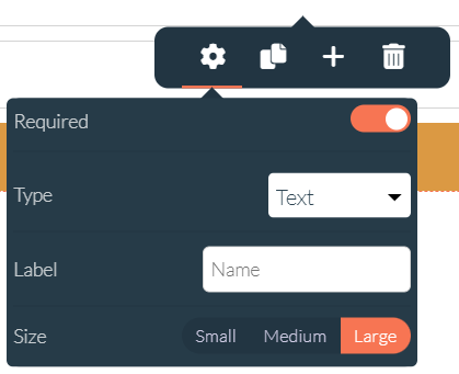
By clicking a field of your form the following menu will appear. When you click the gear wheel you are able to change different aspects of your form.
When you check "required" the visitor must fill in this form to apply your form. Users who don't fill in the right data can't succeed.
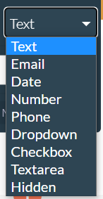
With type you can tell if it's an e-mail, text or number field. It is important to give your field the correct type. It works like this:
For example, you can use a checkbox to make your visitor agree with delivering their credentials.
With size you can change the length of field. You can choose: small, medium or large.
When your form is integrated into a pop-up the field will be smaller than in a full width section. The size of your form will be different according to the size of the section you are using.
With this icon you can drag your form inside your section.
By clicking the trash icon you are able to delete your form.
With the duplicate icon you are able to copy your form inside your section.
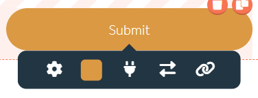
The button in a form, has new options that are particular to the form. When you click on the button you see the following menu appearing:
The gear icon is to make changes to the styling of the button itself
The color block is to give the button a different color
The plug icon is to add integrations to your form
The arrows icon is to switch to a different form
The chain icon is to add a message or a URL behind the button

