You can add a button to send your visitor to a different webpage or if you don't want a direct form on your page.
By clicking the button option it will show a button which you can edit to your own style.
By selecting the text within the button you can edit it.
When you click on the button the following pop-up will show:
Styling
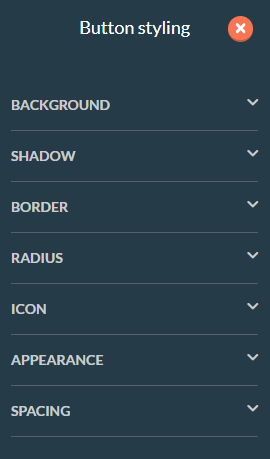
When you click the gear wheel you will open the Button Styling menu. Here you can edit the background, shadow, border, radius, icon, appearance or the spacing of the button.
Background
You can edit the color of the button itself, not the color of the text. 
Shadow
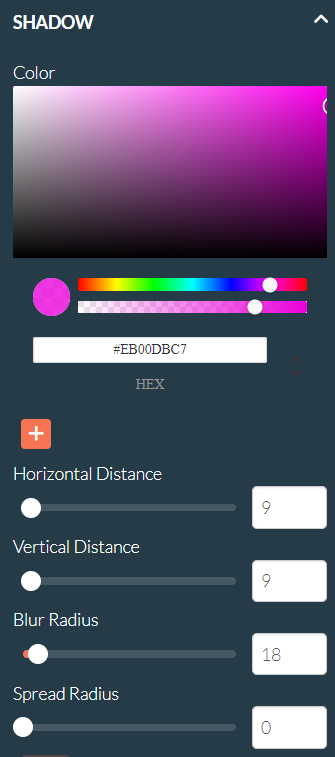
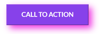
Here you can add and edit the button's shadow. You are able to select any color for the background, the horizontal and vertical distance, how blurred the shadow is and the spread radius (the size of the shadow).
Border
In the border settings, you are able to add and edit the border of your button. You are able to change the color, the thickness and the type of the border.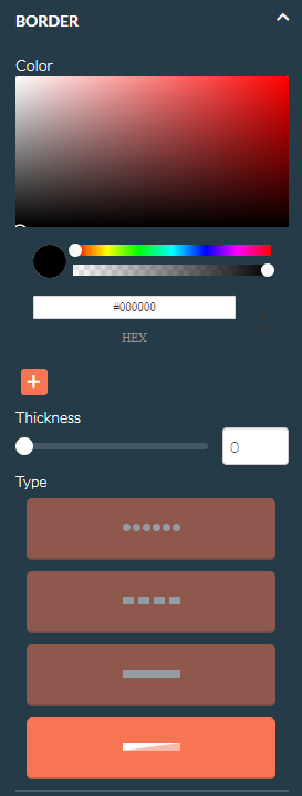
Radius
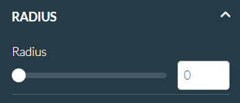
Here you can change the radius of the button which has an effect on the corners of the button.
Icon
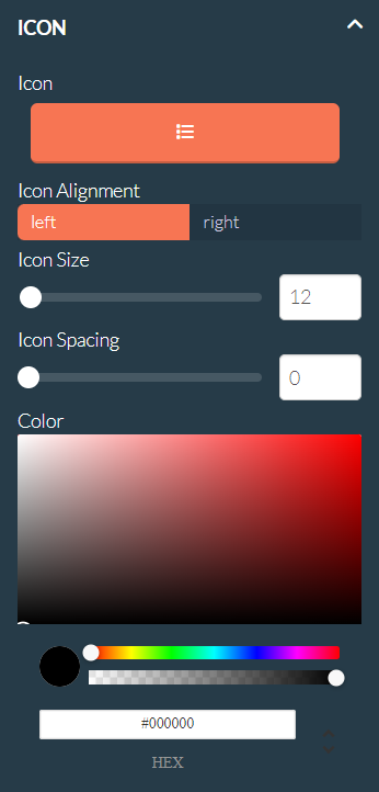
With this setting you are able to add an icon from our icon library to your button. You are also able to edit the alignment, the size, the spacing and the color of this icon.
Appearance
Here you are able to change the width and the alignment of the button. You can choose between a custom width or an automatic width based on the text or icon within the button. You can also choose to align the button on the left, the right or in the middle of the section.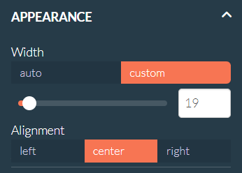
Spacing
With this setting you can change the spacing within the button. Spacing is the space between the text/icon and the border of the button. It is possible that nothing happens with the vertical spacing when you have chosen a custom width in the Appearance settings.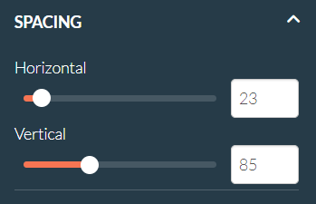
Linking
When you click on the chain icon you are able to link the button to a few different places
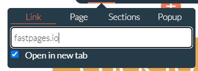
When selecting the Link option, you are able to make your button link to a URL. You can also link them to a direct phonecall or email with the options tel:phonenumber and mailto:emailadress.
When selecting the Page option, you can make your button link to any page from within your project.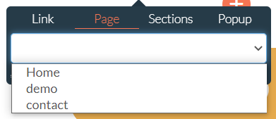
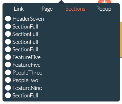
When selecting the Sections option, you can make your button link to any section from the page your button is located on.
When selecting the Popup option, you can make a popup appear when a user clicks that button.
Alignment
When you click on the hamburger icon you are able to change the alignment of the button.
You are able to change the alignment of the button to the left, the right or the middle of the section. The alignment is also editable under the gear icon in the styling menu.
Colors
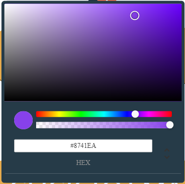
When you click on the color block you are able to change the color of the button.
You are able to change the background color of the button here, not the color of the text. The color is also editable under the gear icon in the styling menu.
CSS
When you click on the CSS icon you are able to add and edit the CSS class names.
With this icon, you can drag your button element inside your section.
By clicking the trash icon you are able to delete your button element. With the duplicate icon, you are able to copy your button element inside your section.


